By Brian Leahy & Tim Yeadon
So you’ve read our article about the pros and cons of custom HTML email templates, and you’ve decided to invest in creating your own. Great!
But what makes a world-class email template?
Let’s start by taking a look at the anatomy of an email.
Anatomy Of An Email
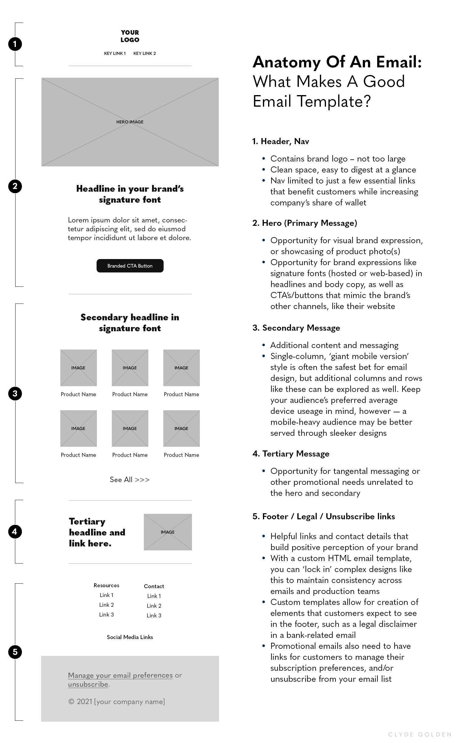
Here is also a more ‘zoomed-out’ look at a typical email’s anatomy:

Next, before you get into the nitty-gritty design details of how to optimize your own template, you should find the answers to these three questions:
First, where are the majority of my email opens and click-throughs coming from – desktop or mobile?
Often, we get more opens on mobile and more clicks on desktop. Knowing your mobile baseline may help you determine if your template should cater more to desktop or mobile. If you want a safe bet, design a ‘giant mobile email’ template – an desktop-sized email that also looks great when scaled down in size for a small mobile screen.
Second, what email inboxes are your subscribers using?
Each inbox has their own idiosyncrasies. For instance, the Gmail webmail recognizes media queries while the Gmail app doesn’t - so your carefully crafted responsive emails will only show the desktop version by default. Outlook suppresses images, while the iPhone native email app doesn’t.
And finally, third, where are your conversions actually happening?
Some people open on mobile, but make the actual purchase on their desktop or tablet. Others are trusting of Apple Pay and other mobile payment systems, and are willing to purchase on their mobile device (completely forgoing the need for investment in the desktop experience). Knowing this may impact how you design your email template.
Now, let’s take a look at the elements that make up a world-class email template.
Elements Of A World-Class Email Template
One of the most compelling reasons to build your own template is that they provide a seamless experience between your email and your website.
With this in mind, your template should contain key design elements that firmly place it in the same world as the rest of your channels – think your website, social media, advertising, etc. This gives you a more professional appearance, helps viewers get to know your brand, and helps to increase trust (which in turn leads to conversion).
A great way to start thinking about this would be to examine your email’s header and footer. Are you providing customers the same experience they expect after interacting with your business elsewhere? This could include branding (logos, typefaces, iconography), and placement of key links. What are the top actions your reader might wish to take after they open your email?
Similarly, the body of your email is a great place to work in world-building elements like buttons and headlines with fonts that mirror the styles on your website.
Speaking of fonts, let’s take a closer look at how these work within email. You’d be forgiven for assuming that adding your brand’s signature font into your email is as simple as changing a setting in your email editor. However, this is not always the case. It’s important to first understand the distinctions between the different categories of fonts for the web, and then determine which category your chosen font(s) falls into:
Web Safe Fonts: These render natively (that is, using the viewer’s device’s own resources) and generally display fine on modern browsers everywhere.
Web Fonts: These are fonts that are made available and licensed for use on websites. They may or may not be free to use. Google Fonts is a good example of free-to-use web fonts. These only display in certain email clients, however, such as the iPhone, Apple Mail, Google Android, Samsung, and the Outlook app. If the viewer is not using one of those, the email will attempt to display the backup font you specify instead (or a default font).
Hosted Fonts: These are actual font files that the email development team packages with the email. These may not be compatible with your chosen email platform, however, in which case it’s necessary to use an external service to host the font. Hosted fonts may take a bit more of your resources to implement, but if your branding relies heavily on a particular font, this may very well be worthwhile.
As you design your template, be mindful of the empty space around elements that you want people to click. You want to ensure that anyone, on any size device, can click your links and buttons with ease. If they are too small or crowded, you risk frustration, or worse – abandonment of the action you wanted them to take!
This diagram lays out some best practices to ensure easy clicking in your template design:

The next thing to keep in mind is that your template should either be responsive, or take the ‘giant mobile email’ approach (i.e. create a mobile email that looks just as good at a larger size, thereby negating the need to solve for different desktop and mobile layouts).
These days, your customers may be just as likely to open your email on mobile or tablet as they are on desktop. In fact, for years we’ve seen our campaigns get more opens on mobile but more clicks on desktop. Slowly though, opens and clicks are evening out among mobile and desktop. This means your email needs to look its best in all circumstances, and if your email intentions call for multiple columns and rows of content, responsive design is the way to accomplish this.
What is responsive design?, you ask.
Using CSS media queries, a single email file can automatically adjust its layout to adapt to smaller mobile environments.
Media Queries make it possible to:
Identify media types
Detect characteristics of device screens and browsers
Trigger breakpoints for layouts
Apply style changes for content
Text and images can be resized, restyled or removed to render better for the mobile user. You can set multiple breakpoints, or add fluid elements.
Media queries have two elements or criteria:
Media Type
Query (Function and Value)
If a browser meets both criteria, then the CSS enclosed in the query will be applied. Note, however, that some email clients and devices do not support media queries. (Litmus has a wonderful guide to illustrate this here).
Our alternative suggestion – designing your template as a ‘giant mobile email’ – is also a great choice if your business needs do not require a multi-columned structure. With this approach, everything is centered within the email, such that scaling to different sizes does not affect the placement of elements, or the distances between them. The only thing that changes is the relative size of elements that need to be resized, like the borders of text boxes, hero images, ruled lines, and background boxes behind text.
Your template should be thoroughly tested and confirmed to work in the widest possible range of email apps and platforms.
It’s an unfortunate truth: the way your email and images render for each recipient has the potential to be inconsistent across desktop, webmail, and mobile inboxes and applications. Take, for example, Gmail and Outlook, two of the more common email clients at the moment: they each render your email differently, and have different rules for image blocking. Additionally, email clients may change what they support, and how, without notice.
So how do you prepare for this? The answer is: test, test, and test some more!
Two great ways to test are either signing up for a wide variety of email inboxes (Gmail, Yahoo!, Outlook, etc) to test your own emails, or to use an email rendering ‘snapshots’ service like Litmus, or Email on Acid. These types of services (most paid, some free) provide a look at how your email renders in a wide range of scenarios. And if you have access to both of these testing routes, even better. We currently use Email on Acid, but have also used Litmus in the past. (Choosing an email render testing tool is a lot like choosing an SEO tool, sometimes you just need to try them out until you find one that works best for you.)
Here are some important questions to keep in mind during your tests:
Are your images successfully rendering?
Many email clients block images by default, and some subscribers choose image-blocking settings on their own. As such, you’ll never be able to completely avoid image blocking. Not to worry – you can (and should) employ techniques like ALT text and strategic placement of background colors. These methods can help your email retain a digestible hierarchy, as well as remain understandable and actionable, even when the images are blocked.
You’ll also want to keep in mind that some clients block images that are too large in size, or even treat such emails as spam. Keep an eye on your image and GIF sizes.
Is your email as accessible and visually compelling on mobile devices as it is on desktop?
Is your email body rendering consistently across devices and clients?
Is your email optimized for legibility and appearance in scenarios where the user has Dark Mode enabled?
Each email client handles Dark Mode differently, so there are recommended safeguards you’ll want to build into your template. Check out our article on Dark Mode email design, as well as our video on How Dark Mode Affects Your Email.
Last (but certainly not least), your templates should be built with the support of a developer familiar with email.
HTML for email is much more stiff, old school, and finicky than modern web development. If your developer is not familiar with it, they should be prepared to spend extra time reading Litmus, Campaign Monitor, and Hubspot’s blogs (to name a couple) as well as learning the basics and pitfalls.
Conclusion
Building a custom email template that performs well may seem daunting at first, but hopefully this article has helped to show that it’s actually quite achievable — and the cost may be lower than you expect. Get in touch with us here at Clyde Golden to learn more about how we can help your business’s email marketing!
About Clyde Golden
Clyde Golden is an email marketing agency in Seattle. We’re here to help you create thoughtful and relevant content that leads your prospects through the buyer journey and on to a long-lasting relationship with your brand.